MY PROJECTS
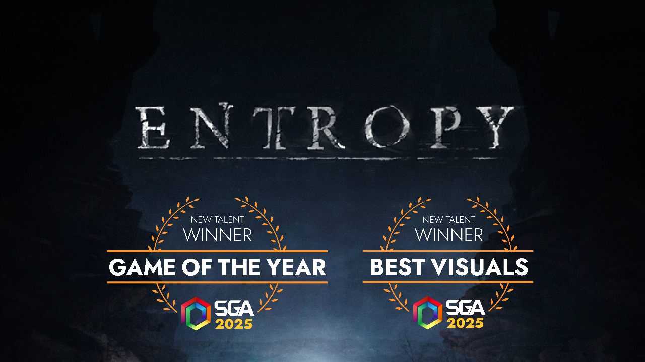
Entropy ▶
A puzzle platformer with elements of horror, set in an ancient temple where light becomes the player’s main tool for exploration.
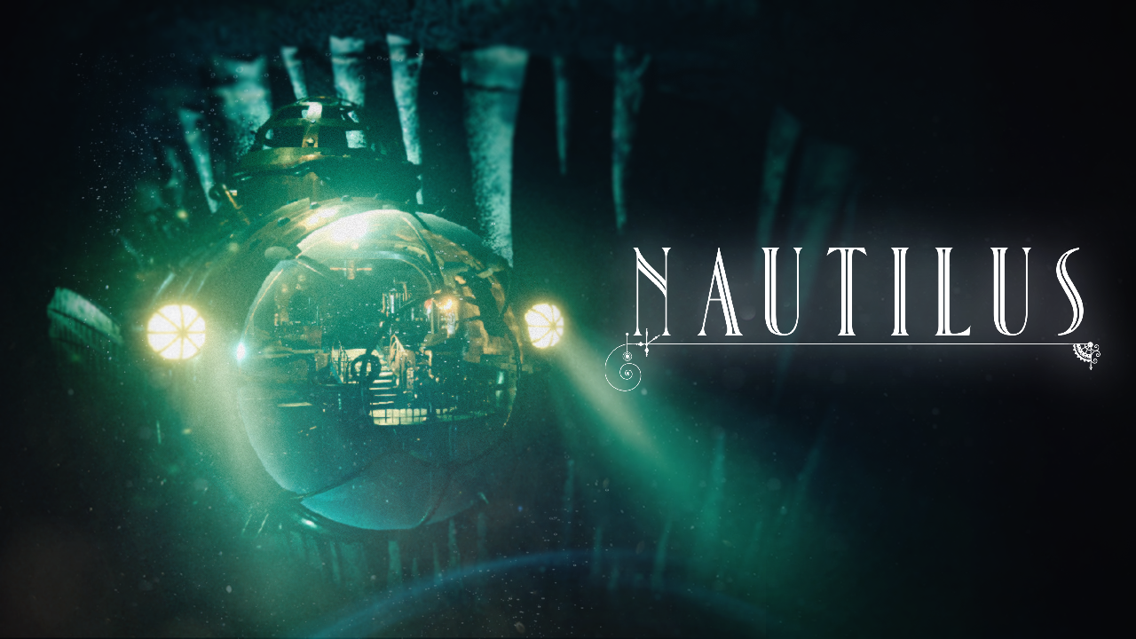
Nautilus ▶
An atmospheric deep-sea exploration experience focused on immersion, visual spectacle, and environmental storytelling, set inside a vast and mysterious underwater cave system.
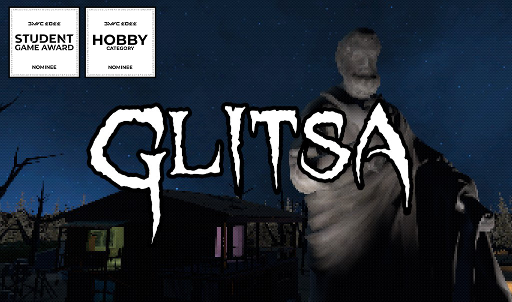
Glitsa ▶
A first-person shooter set in 1960s Crete inspired by Dusk and other games of the boomer shooter genre.
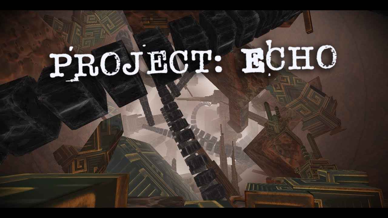
Project: Echo ▶
An atmospheric puzzle platformer, set in a massive alien tunnel.
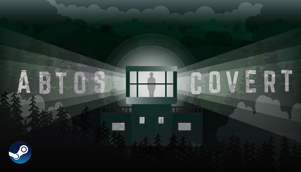
Abtos Covert ▶
A survival horror game in which you play the role of a soldier keeping guard on a remote outpost out in the woods.
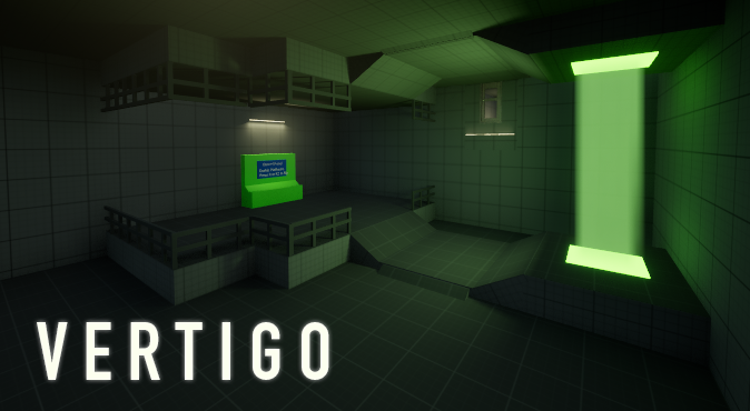
VERTIGO ▶
A surreal atmospheric game with gravity mechanic.
JAMS & OTHER PROJECTS
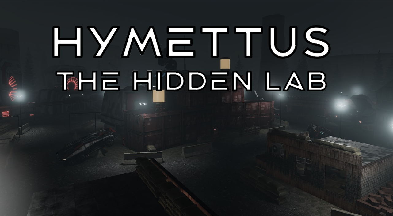
Hymettus ▶
A multiplayer FPS Game set in a hidden military lab on Mount Hymettus.

Baggatch ▶
A 90s Greek airport puzzle game about lost baggage and a mechanical claw.

Glitsa is a first-person shooter set in 1960s Crete inspired by Dusk and other games of the boomer shooter genre. The protagonist is a former cultist going back to his village to get his revenge by killing the arch-priest for sacrificing his mother when he was a child. Use your wits, your guns and your glitsa (a shepherd’s crook) to exact justice and rid the island of the cult once and for all.
We were a small team, but we were all on the same page about the kind of game we wanted to make. As big fans of boomer shooters, we were excited to try creating one ourselves both in terms of gameplay and visual style.
The project was part of our university coursework, with a deadline of 12 weeks.
We didn’t have any dedicated artists on the team, so we leaned into “programmer art”. Thankfully, the retro aesthetic of boomer shooters made it easier to get away with visuals that weren’t perfect. Let’s just say… there was a fair bit of asset flipping involved.
Still, we’re really proud of how it turned out in the end.

Major Contributions
Level Design:
Designed all levels from blockout to final layout, focused on fast-paced flow, readable combat spaces, and classic boomer-shooter progression.Gameplay Integration:
Improved clarity by placing keys/pickups in strong sightlines and adding readable feedback (visual + audio cues) so players understand hits, damage, and pickups without UI.Tutorial Flow:
Designed a short intro “Taxi Drop” that teaches movement, aiming, pickups, and combat through layout and pacing, without pop-up tutorials.Environment & Readability:
Worked within “no artists” constraints using asset flipping and simple visual rules to keep spaces readable and intentional.
Level Design
I designed all of Glitsa’s levels with a focus on fast-paced, readable, and rewarding progression. Each stage was planned from blockout to final gameplay layout, balancing speed and control, inspired by Doom, Dusk, and boomer shooter classics.
Level 1
Cretan Village
This level takes place in a fictional Greek village and is divided into multiple gated stages to control pacing and difficulty. The path is linear but layered, encouraging forward motion while teaching mechanics through environmental design.
Key-based level divided into three gated stages:⚫-Village Square Starts open, allowing space to experiment with movement and combat.🔴-Neighborhood Introduces tighter paths and more enemy control.🟢-Cemetery Farm + 🟣Maze Final phase with a wheat-filled maze and denser enemy placement.The level slowly scales up movement challenges, enemy density, and verticality. Jump thrusters and teleporters are introduced. Visual blockers like fences are used to prevent sequence breaking. The layout pushes players forward while encouraging speed and aggression.
Designed to ease players into the flow of the game while delivering a fast-paced, readable combat rhythm.

Player Route Map


Pickables and enemies Map

Level 2
Hidden Facilities
This level is a shift in tone and complexity. Set beneath the surface, it tests everything the player has learned so far — movement, pathfinding, and pressure handling across four distinct environments. Each stage was designed to challenge the player in a different way.Key-based level divided again into three gated stages:⚫-Factory Wide arena with stacked platforms, open combat.🔴-Disposal Pool Side paths, backtracking, and hidden pickups.🟢-Mines Tight, torch-lit tunnels filled with ambushes.🟣-Church A large, cathedral-like space for the final boss.Progression is vertical and nonlinear at times, with the player constantly moving between layers using jump pads. Keys and gates are used to pace progress, and lighting is the main navigation tool in dark spaces.
Designed to push movement, awareness, and pacing across four distinct underground stages.


Factory
This space introduces verticality as a key design element. With stacked balconies circling a massive central machine, players must think in three dimensions. Enemies are placed across multiple heights, and the key is located on the top level requiring the player to engage with jump pads and mid-air navigation.Designed to shift the player’s thinking from flat to vertical, rewarding precise movement and observation.

Designed to shift the player’s thinking from flat to vertical, rewarding precise movement and observation.

The Pool
A low-ceilinged, claustrophobic area centered around a glowing sludge pool. Here, the level tests the player’s ability to navigate tight spaces while under pressure from above with enemies positioned on bridges and catwalks. The key is hidden in a side room toilet, encouraging exploration off the main path.Built to interrupt the player’s sense of flow and force close-quarters control in a tight, reactive layout.

Built to interrupt the player’s sense of flow and force close-quarters control in a tight, reactive layout.

The Mine
The most disorienting area in the level. Torch-lit tunnels and low visibility make navigation intentionally confusing. Spider enemies hide around corners, forcing quick reactions. The layout loops and branches, and the key is placed deep within the maze.

Designed to induce tension and reward players who stay calm, deliberate, and thorough under stress

The Church
The final arena of the level. This space contrasts the industrial and natural environments before it with solemn, symmetrical architecture. Players receive their last weapon upgrade here before the boss fight. The church’s scale and lighting are used to prepare the player mentally for the game’s climax.Meant to slow the pace before the final fight, using architecture and tone to create weight and finality.

Meant to slow the pace before the final fight — using architecture and tone to create weight and finality.

Gameplay Integration
In early builds, players often missed important items or got stuck navigating, which disrupted the flow we wanted. To fix this, I focused on connecting gameplay systems directly to the level layout, and enhancing interactions with visual and audio feedback to keep things clear and satisfying.
The first problem we faced was that keys, doors, and pickups felt forgettable or hard to notice. They didn’t catch the player’s attention, and often got overlooked during testing.So to fix it, I made sure these items were placed in strong sightlines added rotating, hovering visuals and made the material emission bright. This gave them that classic boomer shooter-style pickup feel that players instantly recognize.

Another issue was that interactions lacked clarity. Players weren’t always sure if they had picked something up, taken damage, or landed a shot.To address this, I helped implement visual flashes, audio cues, and screen effects for those moments. This made interactions more satisfying and helped players understand what was happening without needing UI prompts.

Tutorial Flow
We called it the "Taxi Drop" because the player gets thrown into the game like they were dropped off at the wrong stop.Early testers loved the energy, but some didn’t catch the basic mechanics quickly enough.
They weren’t sure how to shoot or where to go next. The challenge was teaching the player without slowing things down or using pop-up instructions.
To solve this, I designed a short intro area that teaches movement, aiming, pickups, and combat flow using only layout and pacing. Items are placed in the player's path to encourage exploration, and the first enemy is positioned in a way that gives players a chance to react and learn by doing. For returning players, the whole thing can be skipped in seconds.


Environment & Aesthetics
One of the biggest limitations we had was the lack of artists on the team. Everything visual had to come from the designers and programmers, which meant a lot of placeholder models, heavy asset flipping, and creative workarounds. The challenge was building a world that still felt intentional, readable, and fun to play in.
Another issue was that interactions lacked clarity. Players weren’t always sure if they had picked something up, taken damage, or landed a shot.To address this, I helped implement visual flashes, audio cues, and screen effects for those moments. This made interactions more satisfying and helped players understand what was happening without needing UI prompts.

About me
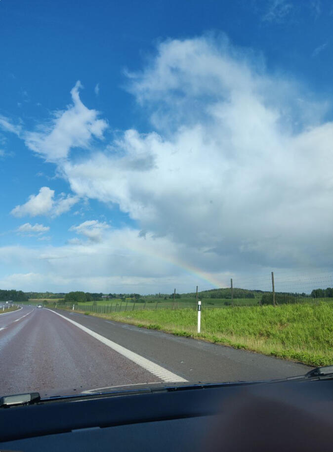
I’m from Volos, a place where you’ll find both mountain trails and beach sunsets, and of course, plenty of tsipouro. It’s a city that balances freedom and contrast, which probably explains why I’m drawn to designing both structured and experimental gameplay.I studied Games Programming at SAE Athens, where I built a solid technical foundation in Unity and C#. But during group work, I was always the one shaping mechanics, tweaking flow, and blocking out levels. That’s when I realized, design is where I belong.

Now I live in Falun, Sweden, studying game design at PlaygroundSquad.I’m focused on level design, working directly in-engine to create immersive environments and refine gameplay systems. I love solving design problems like player navigation, visual cueing, and building tutorials that teach without words.I enjoy being the duct tape between disciplines, making sure gameplay feels right, flows smoothly, and actually makes sense to the player. I work hands-on, communicate often, and love bringing rough ideas to life through iteration and testing.
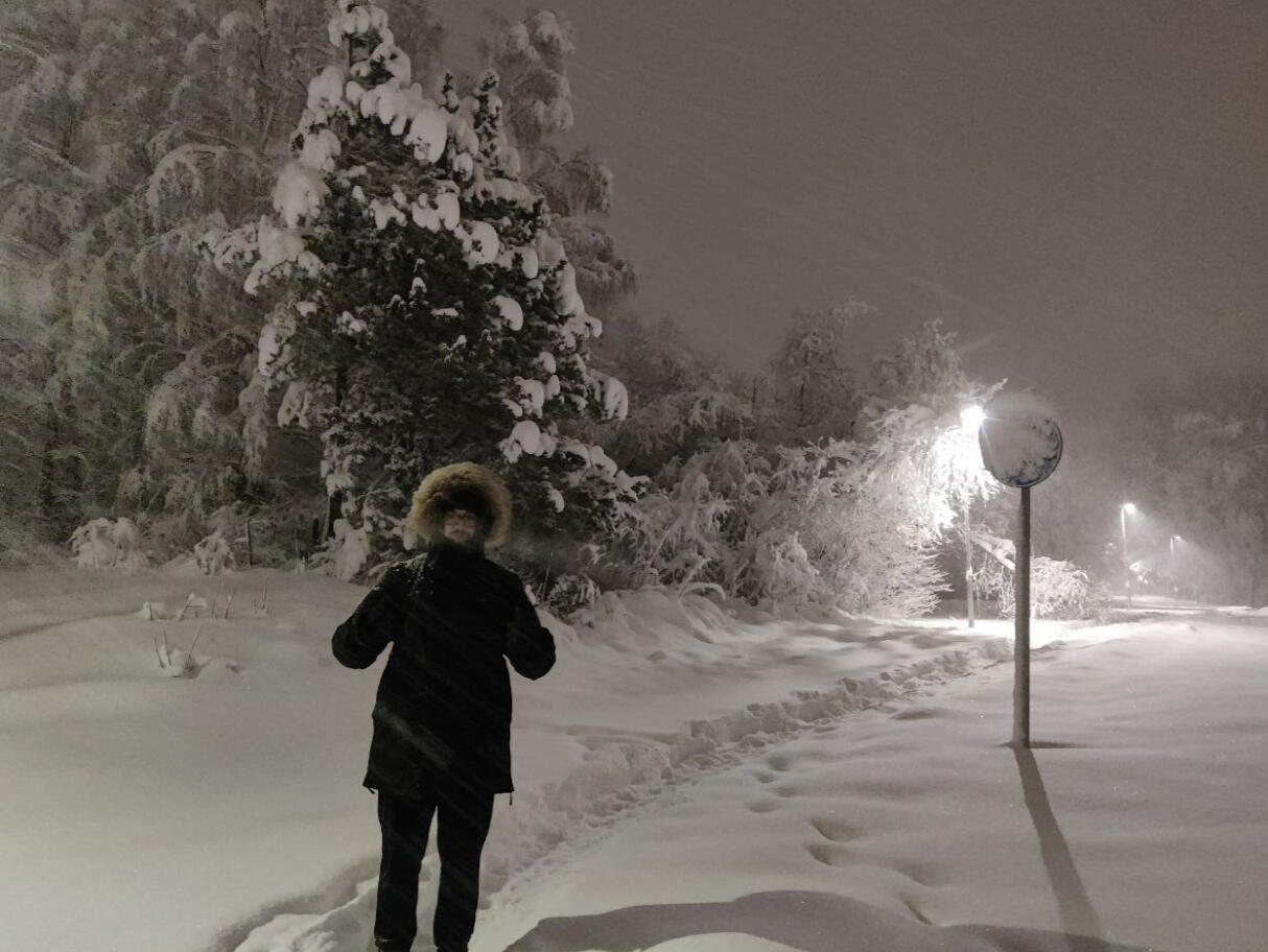
Going from +30°C summers to -20°C winters was a serious shift, but I’ve come to love the cold, the snow, and especially long car rides through forests I never thought I’d live near.When I make games I focus on creating immersive spaces where gameplay feels natural, mechanics feel responsive, and players are taught through movement, layout, and design, not popups.I love working across disciplines, getting deep in the engine, and making games that are just fun to explore and figure out.
The games I love most are the ones that challenge you to think creatively, explore at your own pace, and experiment with systems.
Games like Portal 2, Outer Wilds, Subnautica, Breath of the Wild, and OneShot have all inspired me whether through clever level design, quiet storytelling, or the thrill of figuring things out without being told how.
And hey Iasonas(Jason) started his journey from the same area as me. Maybe Volos is just built for adventures
NIKOLAS JOUKOWSKI